

Hangout Festival Website Redesign
The challenge was to redesign a music festival website with a consistent and cohesive design.
User Journey Maps
1. Getting a ticket
The hangout festival needs a better way to compare packages, many of the tiers feel the same and it’s hard to compare what is best. They want it to be easy to decide what ticket to buy.
2. How to travel
The Hangout Festival needs an effective way to help with traveling ways because there is not enough information on shuttle services and areas to park as well.
3. Finding merchandise
The Hangout festival needs a better way of promoting their merch because they could gain more advertisement and increase their sales. It was also hard to locate where the merchandise was on their website.


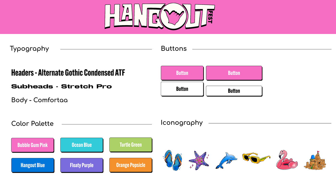
Style Tile
These are my buttons, icons, colors, and typography I have used throughout the website.
The original Home Page

My Redesigned Home Page
I changed the colors around and reordered items they had on their home page because it seemed crowded and it did not fit well in the space together. I moved some items they had down throughout the home page and created a better eye catching design with a moving animation of their logo.

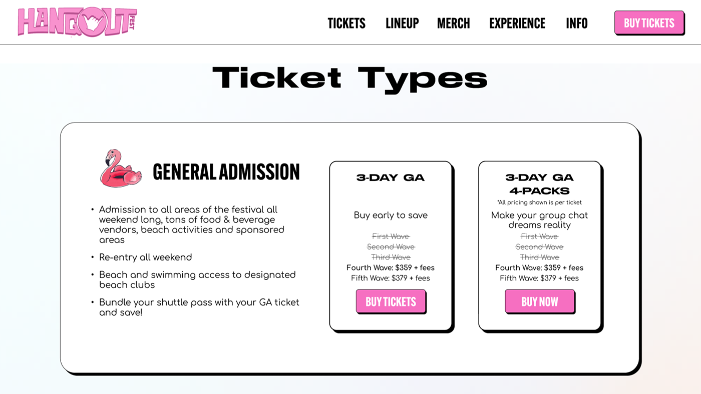
Ticket Page
A big problem they had with their ticket page was the layout. They had a lot of empty space that could have been eliminated. Each ticket tier also took up a big amount of space on the page. I kept all the information they had but designed it in a way that stays consistent.

My Ticket Page
I cut down on white space while still keeping the similar design intact. With a layout like this it's easier for the viewer to scan through each ticket tier and expect what they are paying for. I also made a pop when you buy a ticket that shows more information regarding the shuttle pass you can include, without it being another package to chose from on the screen.
Traveling
I wanted to make it easier for the buyer to locate information such as traveling information. I incorporated an information tab in the header for easy location. When searching on the page it was challenging to find. I designed a card that switches to the information when you click.

Finding Merch
When locating merchandise on the website that was also a challenge. When finding it you are directed to another link that makes it annoying for the buyer. I incorporated the "must have merch" on the homepage to make it easy and accessible. There is also a merch tab in the header of the website. From there you can look at your options without being brought to another page.

Walkthrough Video


